Smart Technology and Member Insights
Smart Technology
Monitor the status of all connected devices and smart equipment in your facility.
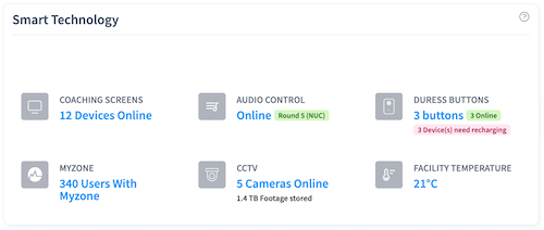
Coaching Screens
Shows how many digital workout display screens are currently online and functioning. These screens show workout routines and timing to members during classes.
Status Indicators:
- Green - Screen is online and working
- Red - Screen is offline or has an issue
Audio Control
Displays the status of your audio system devices. If you haven't configured any audio devices yet, you'll see a message about setting them up.
Duress Buttons
Shows how many panic buttons you have installed and their status. These are safety devices that staff can press in emergency situations.
Important: If you see a red battery warning badge, those buttons need recharging immediately. Low battery on safety devices is a critical issue.
MyZone
If you use MyZone heart rate monitors, this shows how many members are currently using the system during their workouts.
Security Cameras
Displays:
- How many cameras are online and recording
- Total storage space being used for video recordings
Alert: A red badge appears if you're running low on storage space. You can manage recordings in the CCTV section.
Facility Temperature
Shows the current temperature inside your facility from connected climate sensors. This updates automatically throughout the day.
Understanding Status Colors
- Green - Everything is working normally
- Orange - Warning state (attention needed soon)
- Red - Critical issue (immediate action required)
Membership Split
Visual breakdown of your membership by gender.
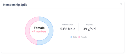
What You'll See
A donut chart showing the percentage and count of male and female members currently active in your facility. This helps you understand your membership composition and can inform marketing and programming decisions.
Data Source and Variation
Member information comes from your partner member management integration. The specific demographic breakdowns and member statistics available depend on which integration your organization uses and what data that system captures.
Peak Time Insights
Understand when your facility is busiest throughout the week.
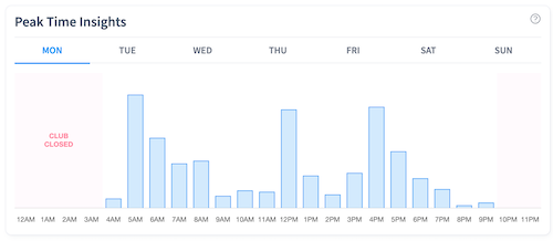
How It Works
A line chart shows relative busyness levels for each hour of the day. You can click on different days of the week (Monday through Sunday) to see that day's pattern.
What It Shows
The chart displays when your facility typically has the most members. The data combines:
- Google Maps Popular Times information
- Your facility's actual check-in records
This gives you the most accurate picture of busy and quiet periods.
Why This Matters
Understanding peak times helps you:
- Schedule staff appropriately
- Plan class times for maximum attendance
- Communicate to members about less crowded times
- Make equipment purchasing decisions
If You See No Data
If this section shows a message about insufficient data, it means you need more check-in history before patterns can be identified. This typically requires several weeks of operation.
Related Pages
Revenue and Bookings - Financial performance and appointments
Reviews and Website Leads - Customer feedback and website activity
Back to Dashboard Overview - Main Dashboard documentation