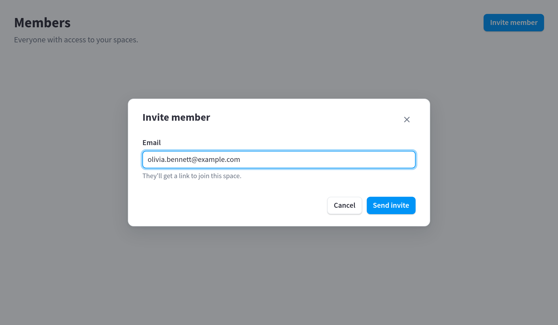
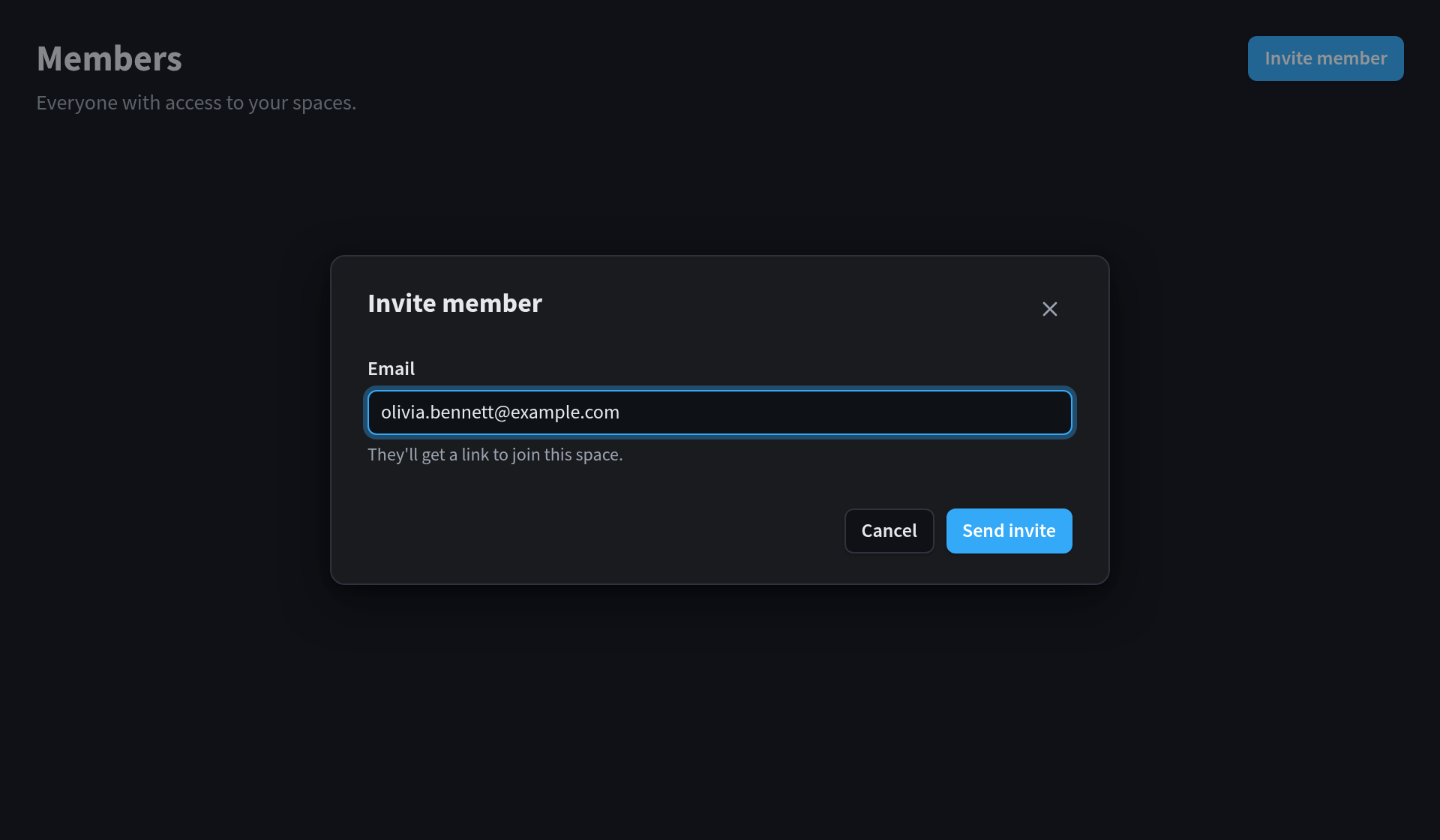
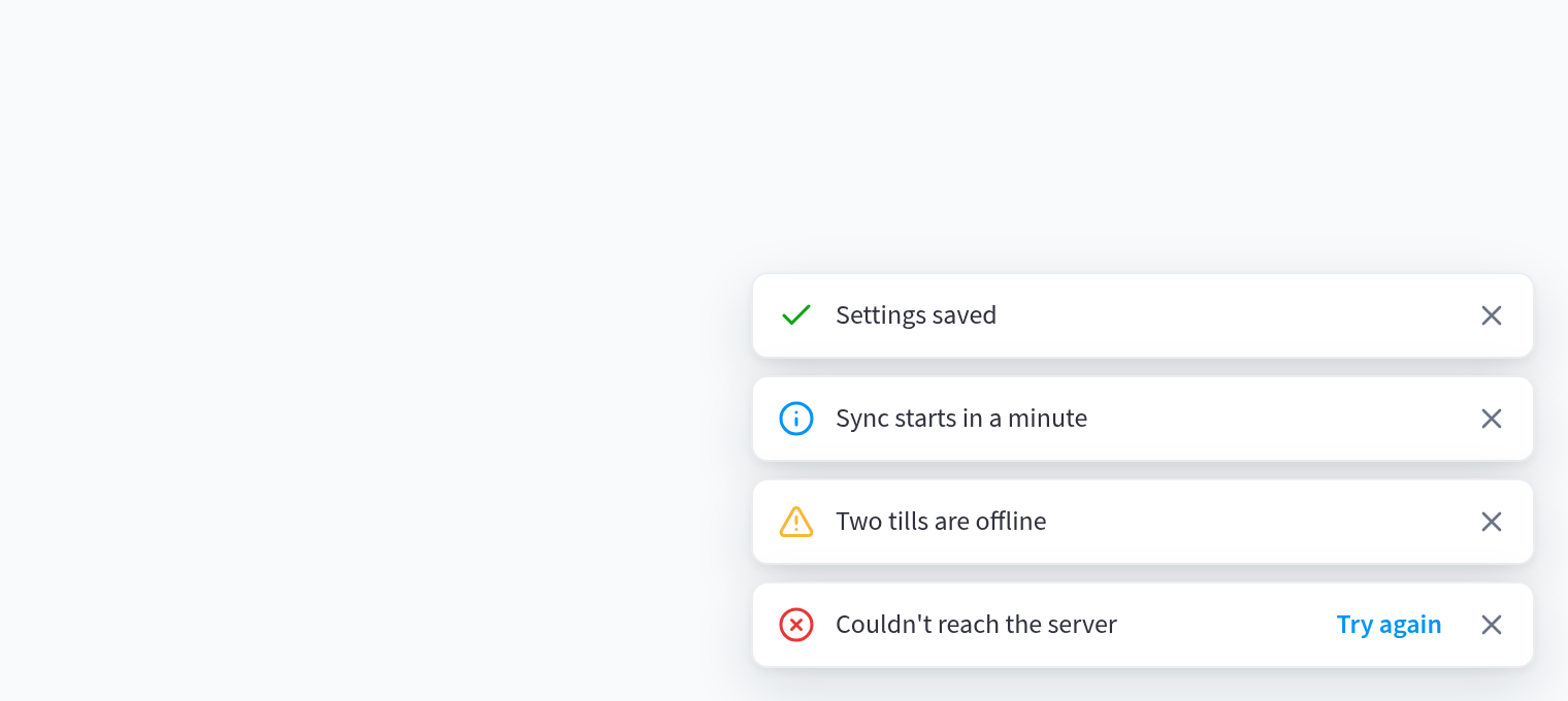
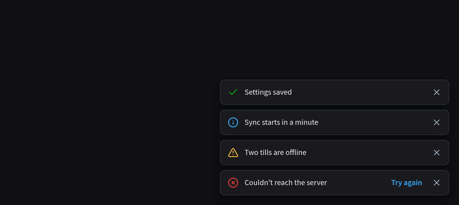
The PH App Kit is the design system for apps that open inside Performance Hub: dashboards, reports,
lists, forms, admin screens and interactive tools. Link one stylesheet and one script, and the app
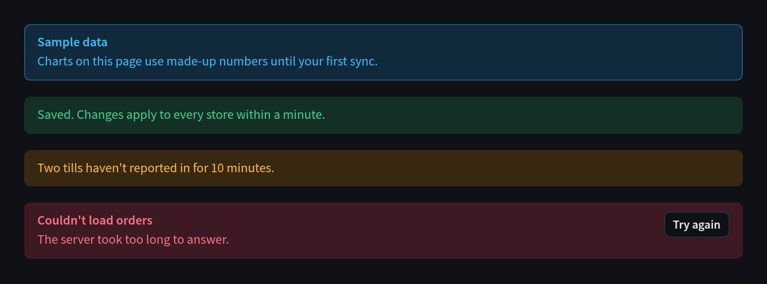
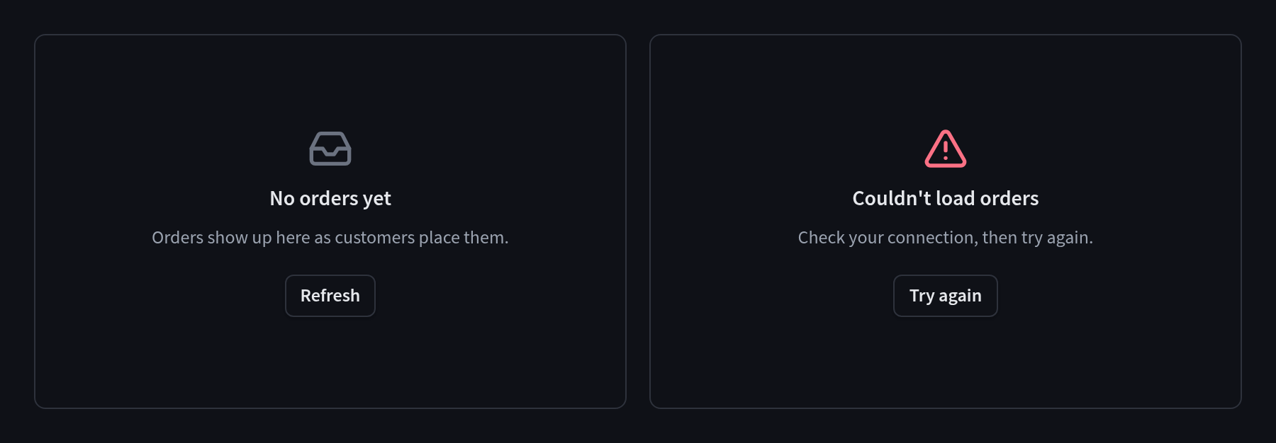
gets the Performance Hub font, colours and components. It also follows the user's light or dark
choice, and Performance Hub's keyboard shortcuts keep working inside it.
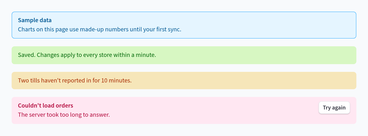
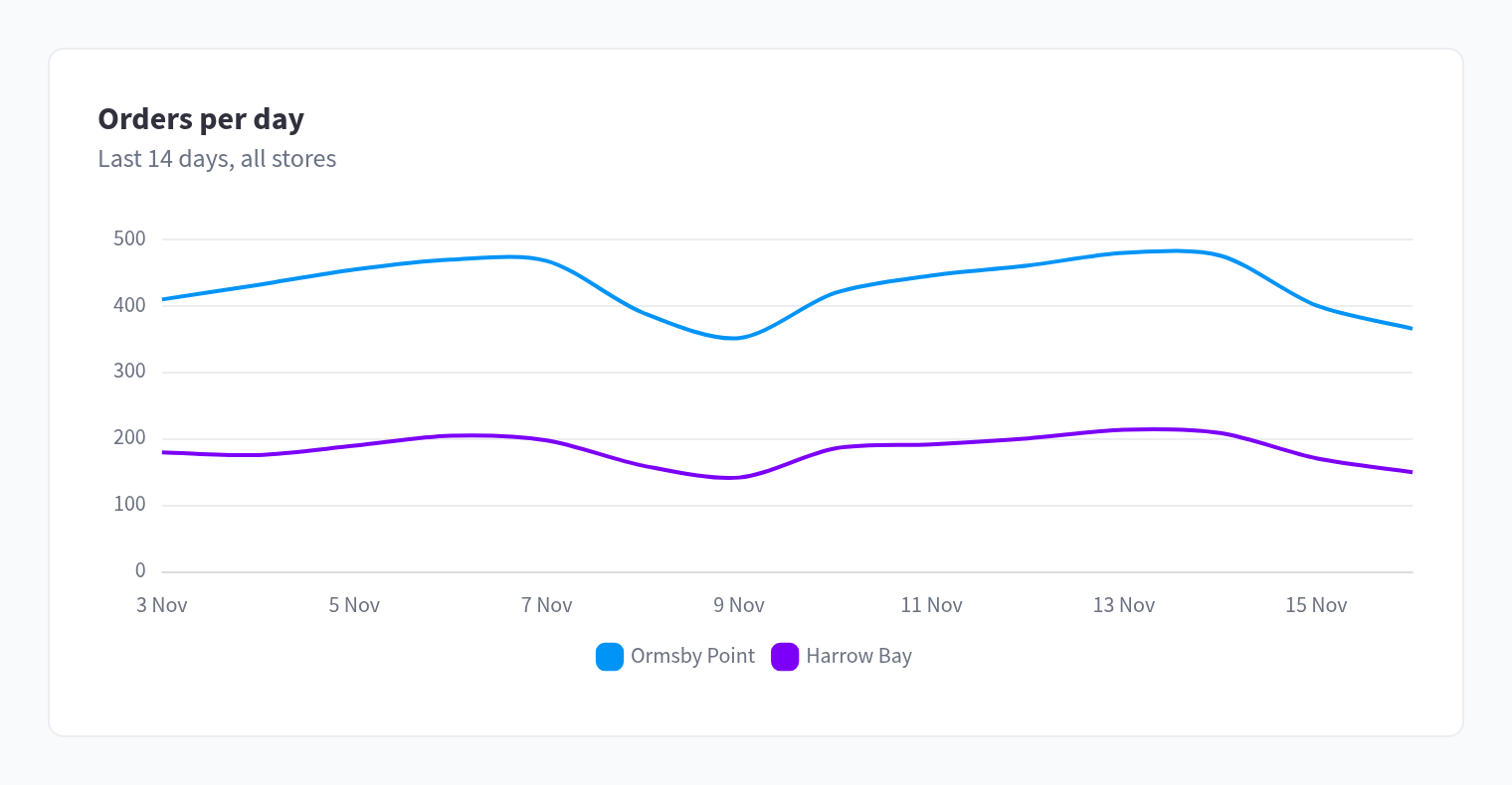
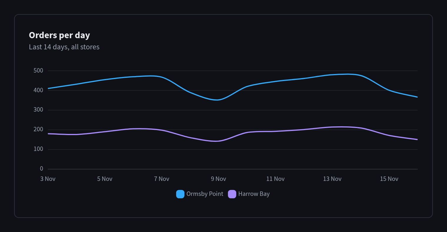
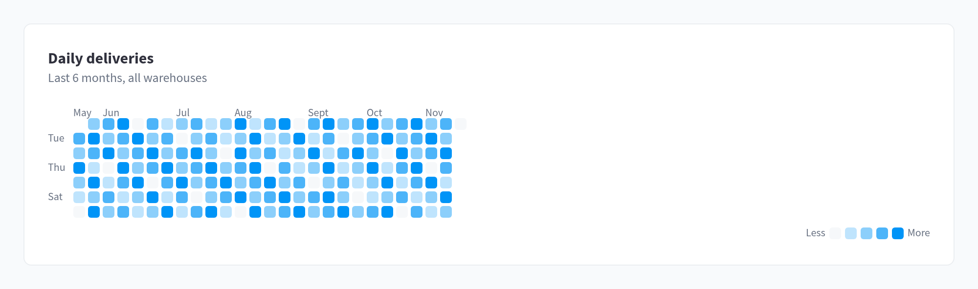
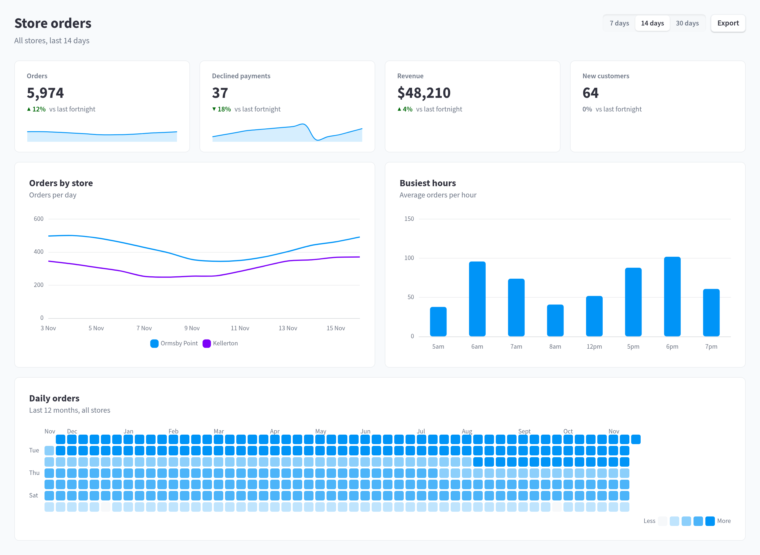
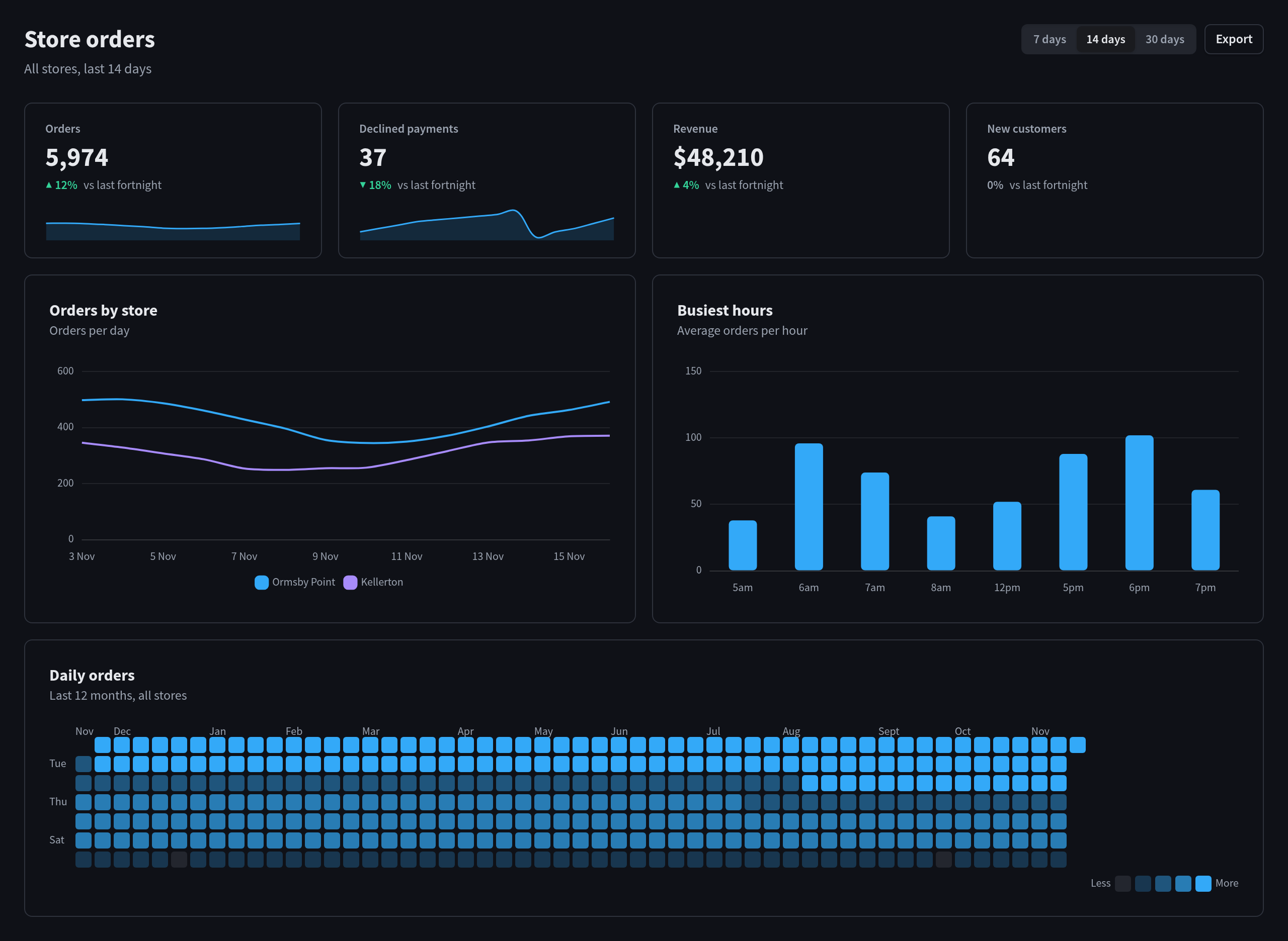
Figure 1: A dashboard built only from kit components
Quick reference
What it is: a hosted stylesheet (ph-app.css), a small script (ph-app.js), optional scripts
for charts, calendars, rich text, maps, data grids and drag-and-drop, and a React package
(ph-app-kit-react) with the same look.
Where it's hosted: Performance Hub serves it at https://app.performancehub.co/assets/app-kit/v1/,
so every app shares one cached copy and picks up fixes automatically.
Who it's for: anyone building an app that people will open from Performance Hub. When the
Performance Hub Agent builds an app for you, it uses the kit automatically. See Building apps with your Agent.
Live examples: every component on one page, in plain HTML:
https://app.performancehub.co/assets/app-kit/examples/plain.html, and the optional modules at
https://app.performancehub.co/assets/app-kit/examples/extras.html.
When to use it
Use the kit for
Don't use the kit for
Dashboards and reports
Websites for a business
Lists and records people browse, search and edit
Landing pages and event pages
Forms, settings and wizards
Portfolios, menus and invitations
Planners, timetables and boards
Anything where the look itself is the point
Admin screens and internal tools
The rule of thumb: if people will mostly use it, build it with the kit. If people will mostly
look at it, design it freely. An app with a public marketing page can do both: the app's screens use
the kit and the marketing page doesn't.
What you get
The Performance Hub look: the Source Sans Pro font, colour tokens, spacing and every common
component, styled the same way as Performance Hub's own screens.
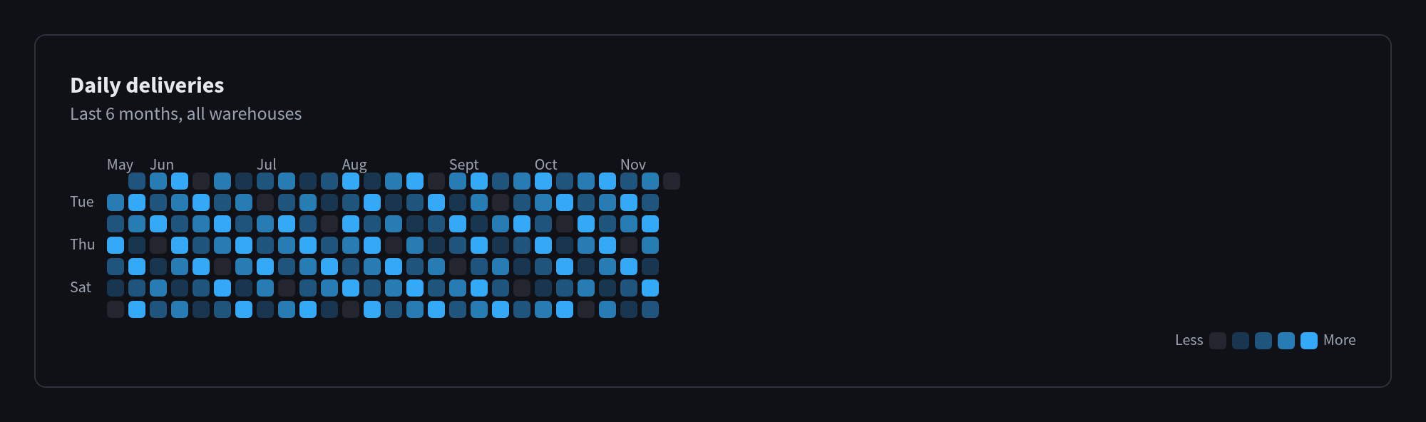
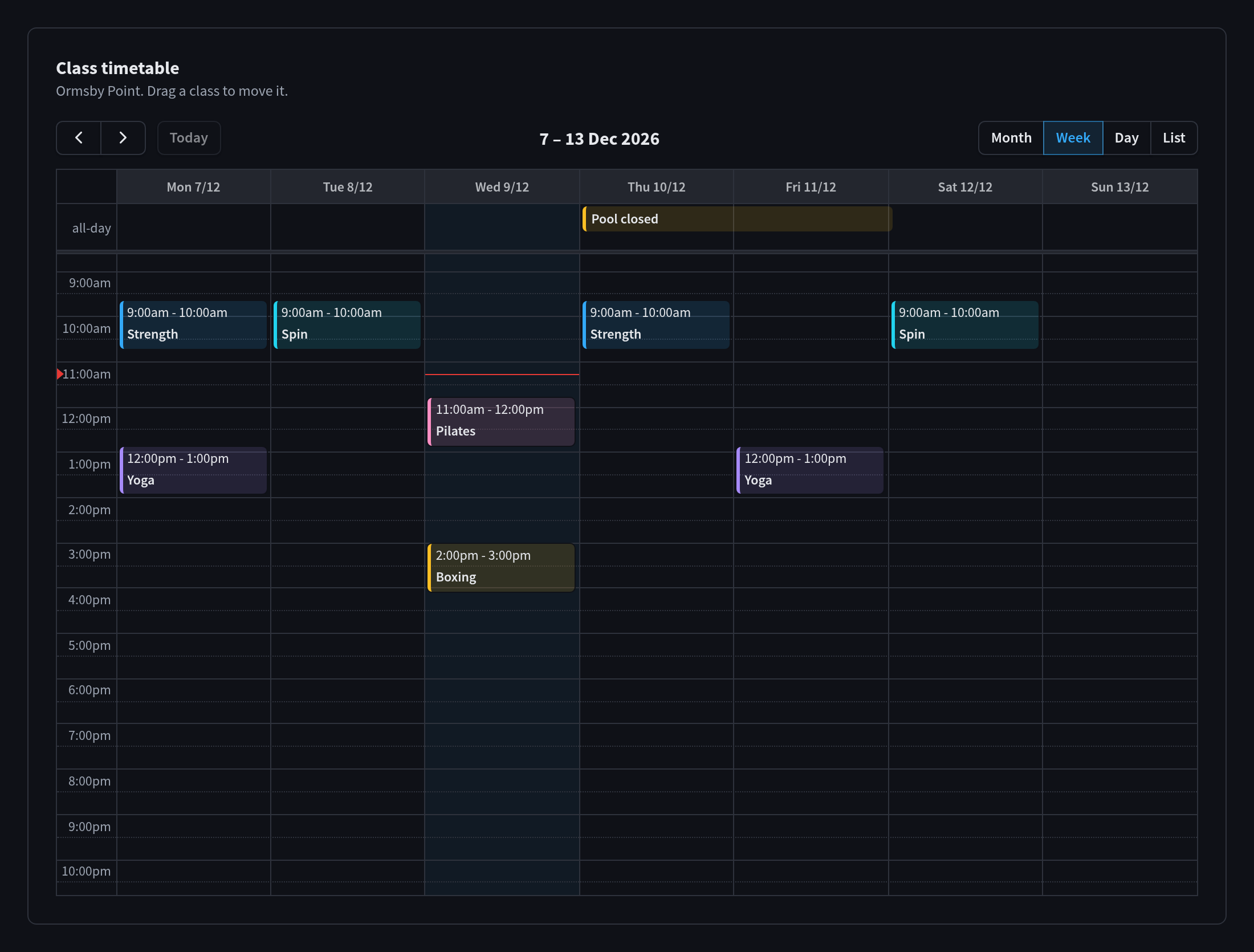
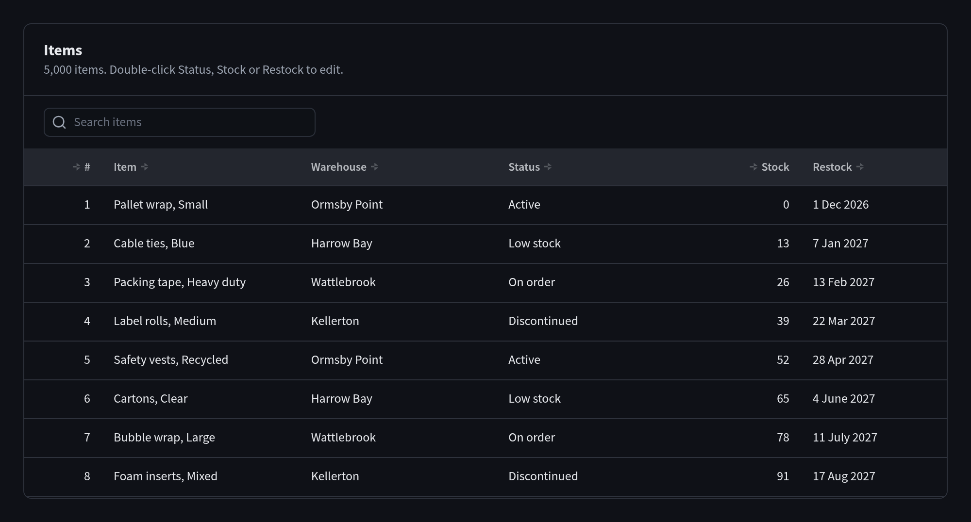
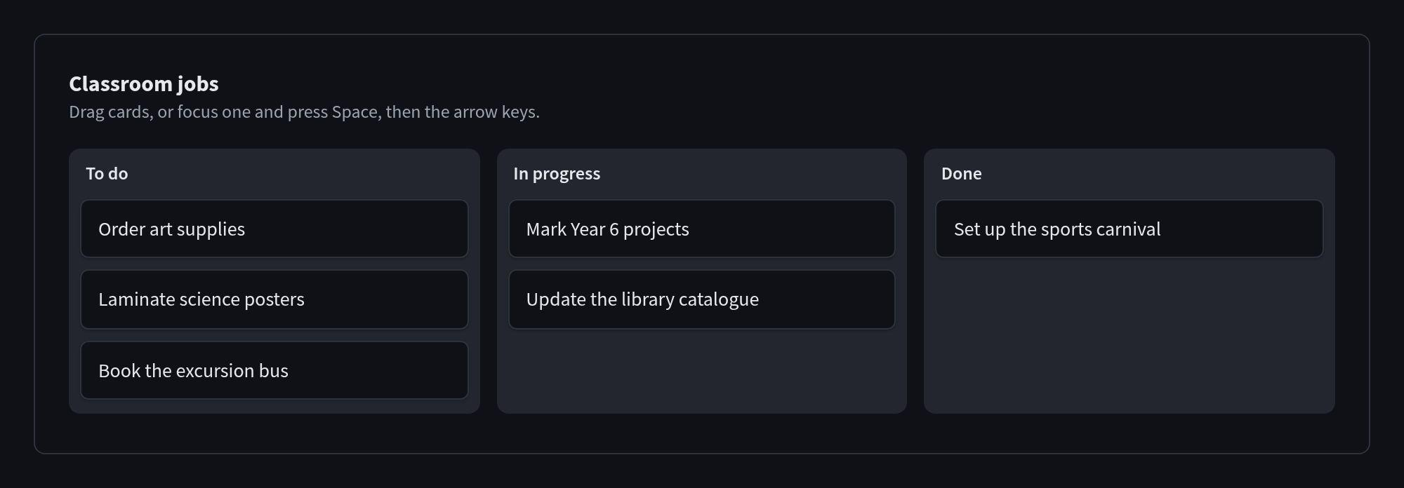
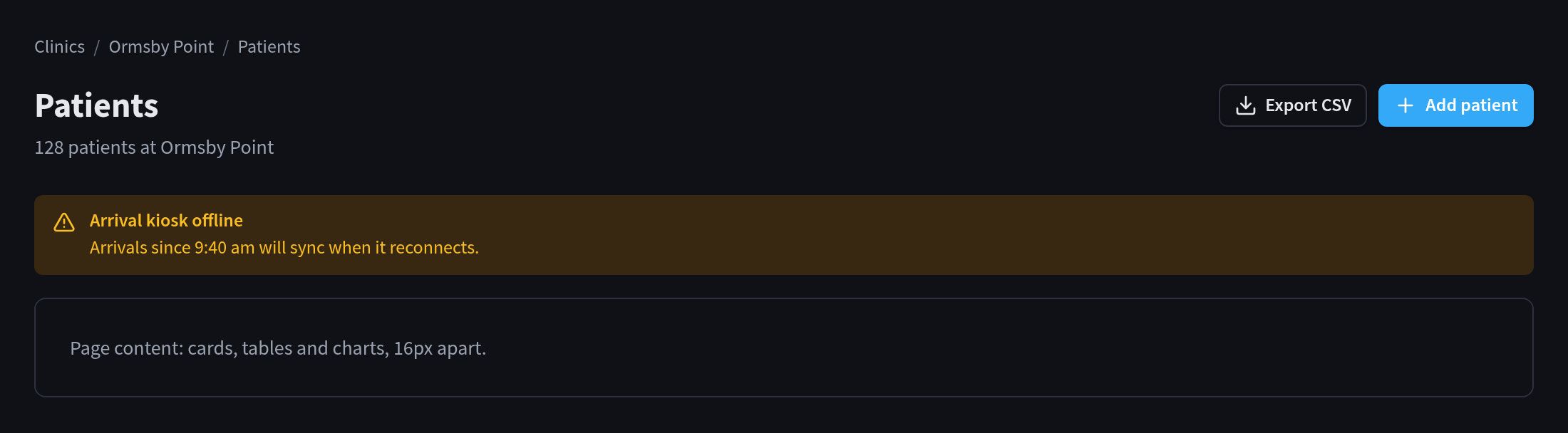
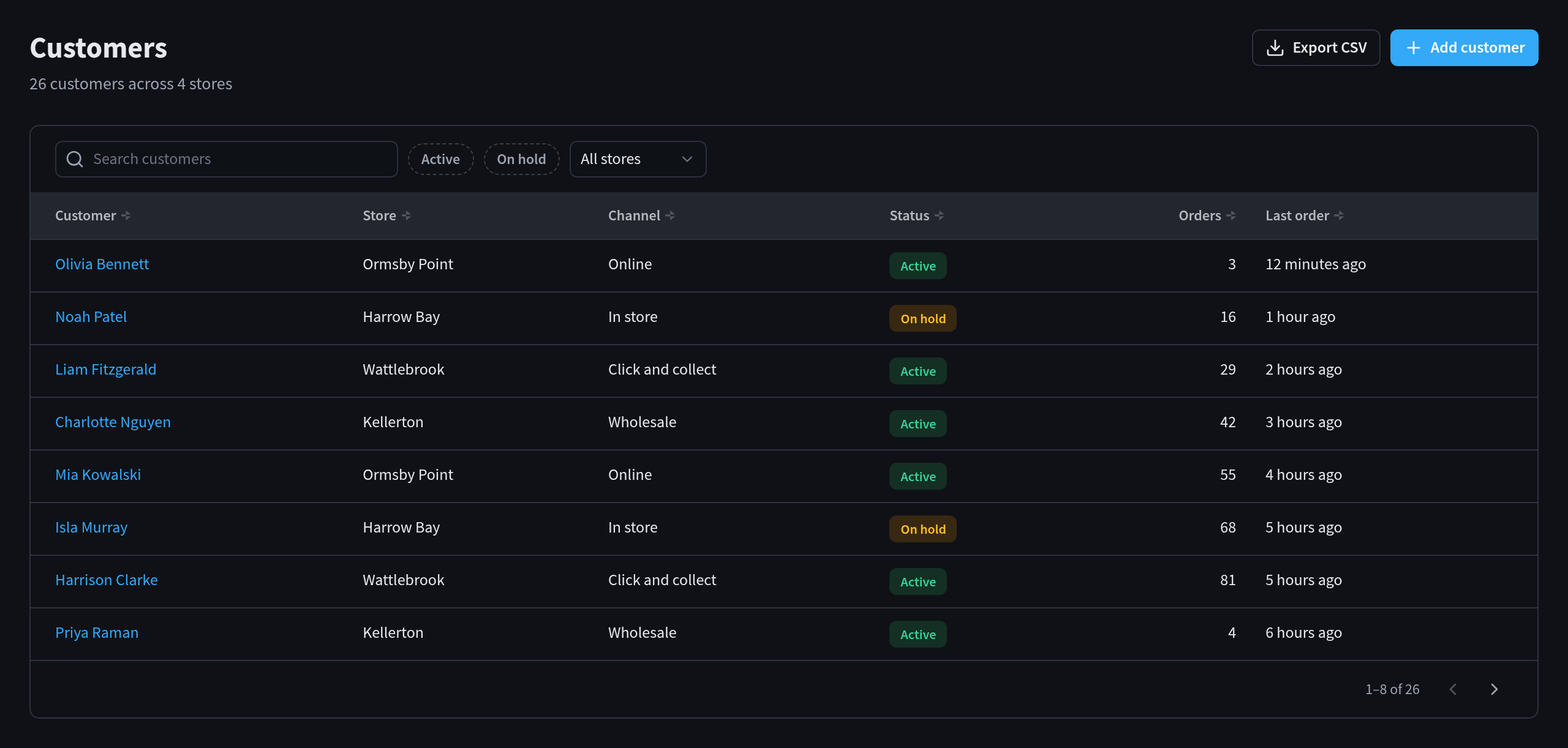
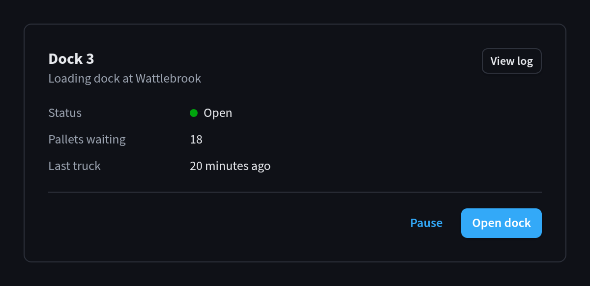
Light and dark mode with no extra work: every component, chart and module has both. Inside
Performance Hub the app follows the user's choice live; in a plain browser tab it follows the
operating system.
Full-width layouts: pages fill the window, so dashboards and tables use wide screens.
Charts, KPI tiles and heatmaps in the Performance Hub palette.
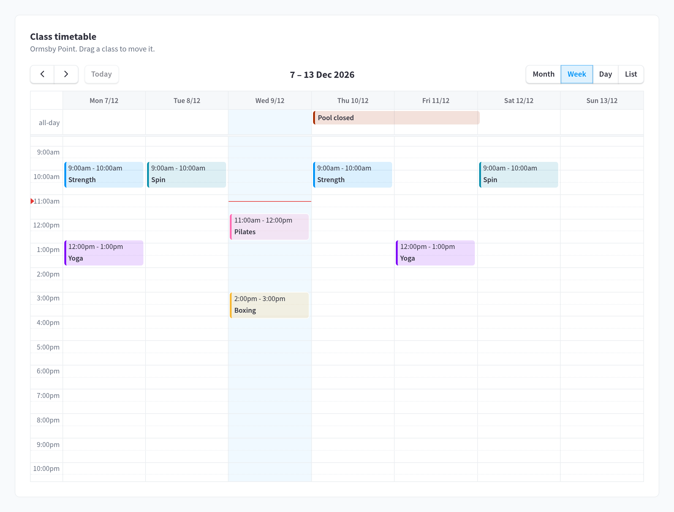
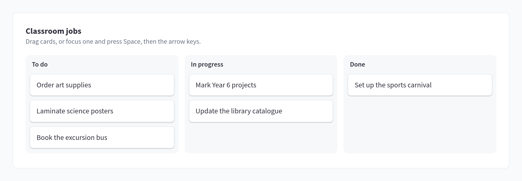
Optional modules for an event calendar, a rich text editor, maps, a data grid for thousands
of rows, and drag-and-drop lists and boards.
Helpers on window.phApp: fetching JSON with timeouts and readable errors, formatting numbers
and dates, CSV export, live updates, toasts and confirmation dialogs.
Performance Hub integration: the app keeps Performance Hub's shortcuts working, dims the whole
window behind its dialogs, and tells Performance Hub when it has loaded.



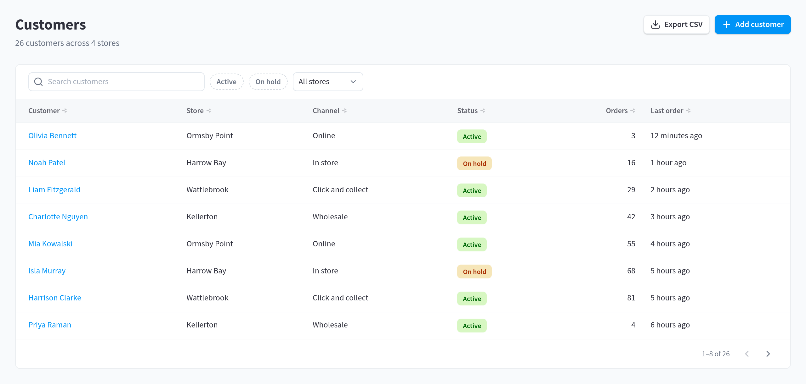
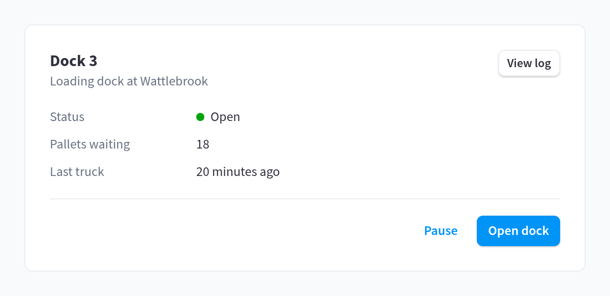
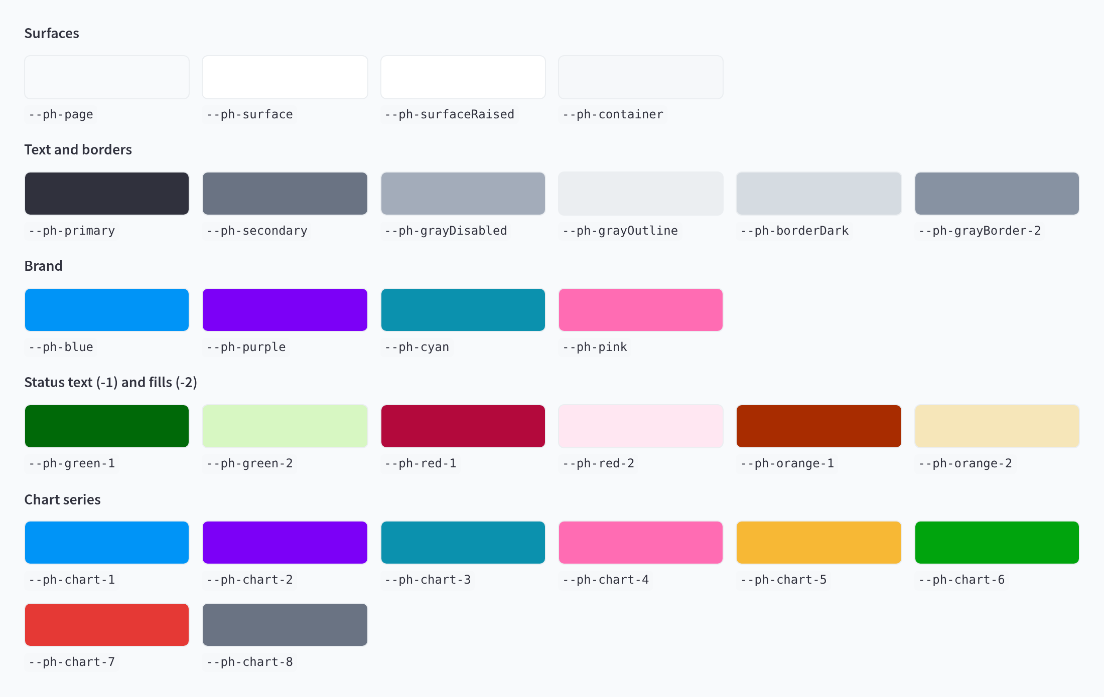
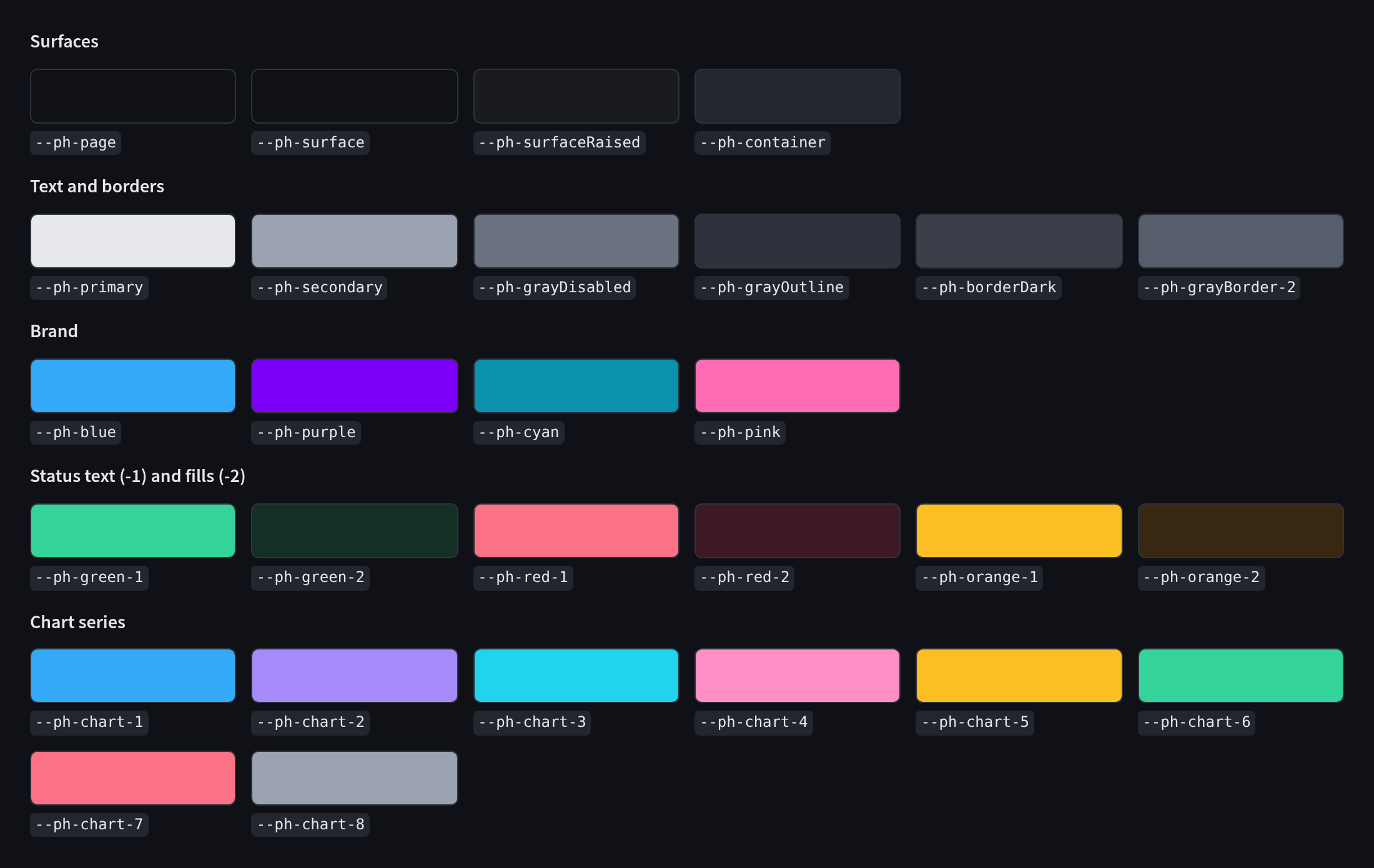

 ButtonsPrimary, secondary, ghost and danger buttons, icon buttons and button groups
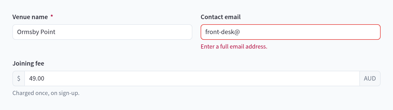
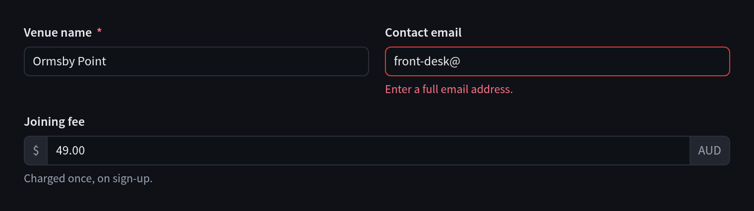 FormsText fields, selects, text areas, checkboxes, radios, switches and sliders

 Segmented controlPicking one of a few options, such as a period

 Toolbar and searchSearch, filter chips and actions above a table
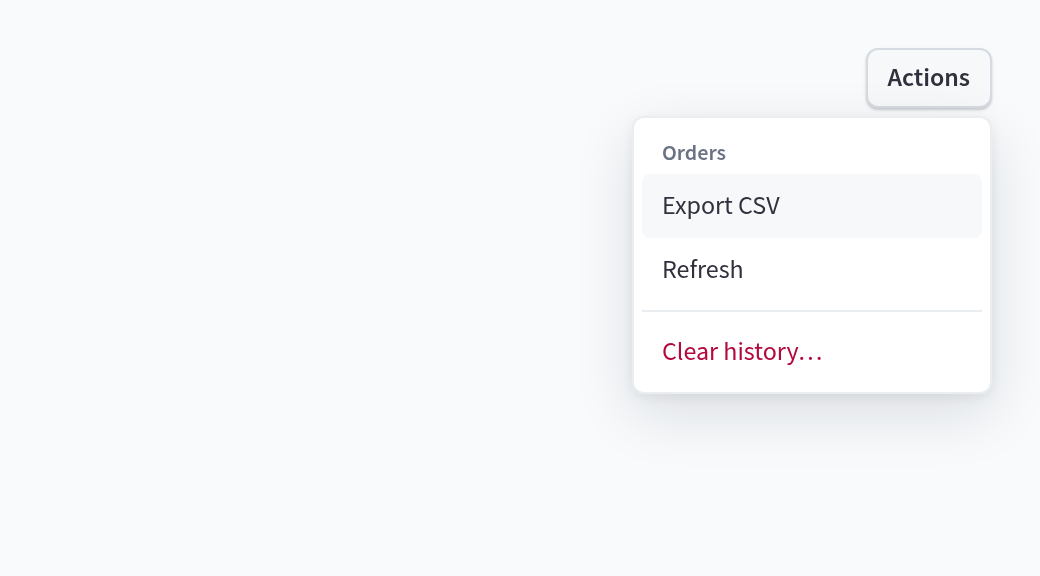
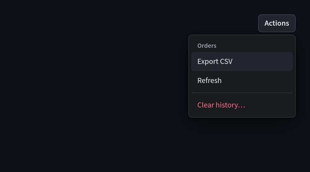 MenusDropdown menus of actions

 TooltipsShort hints on hover and keyboard focus






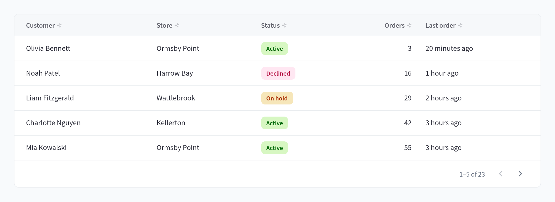
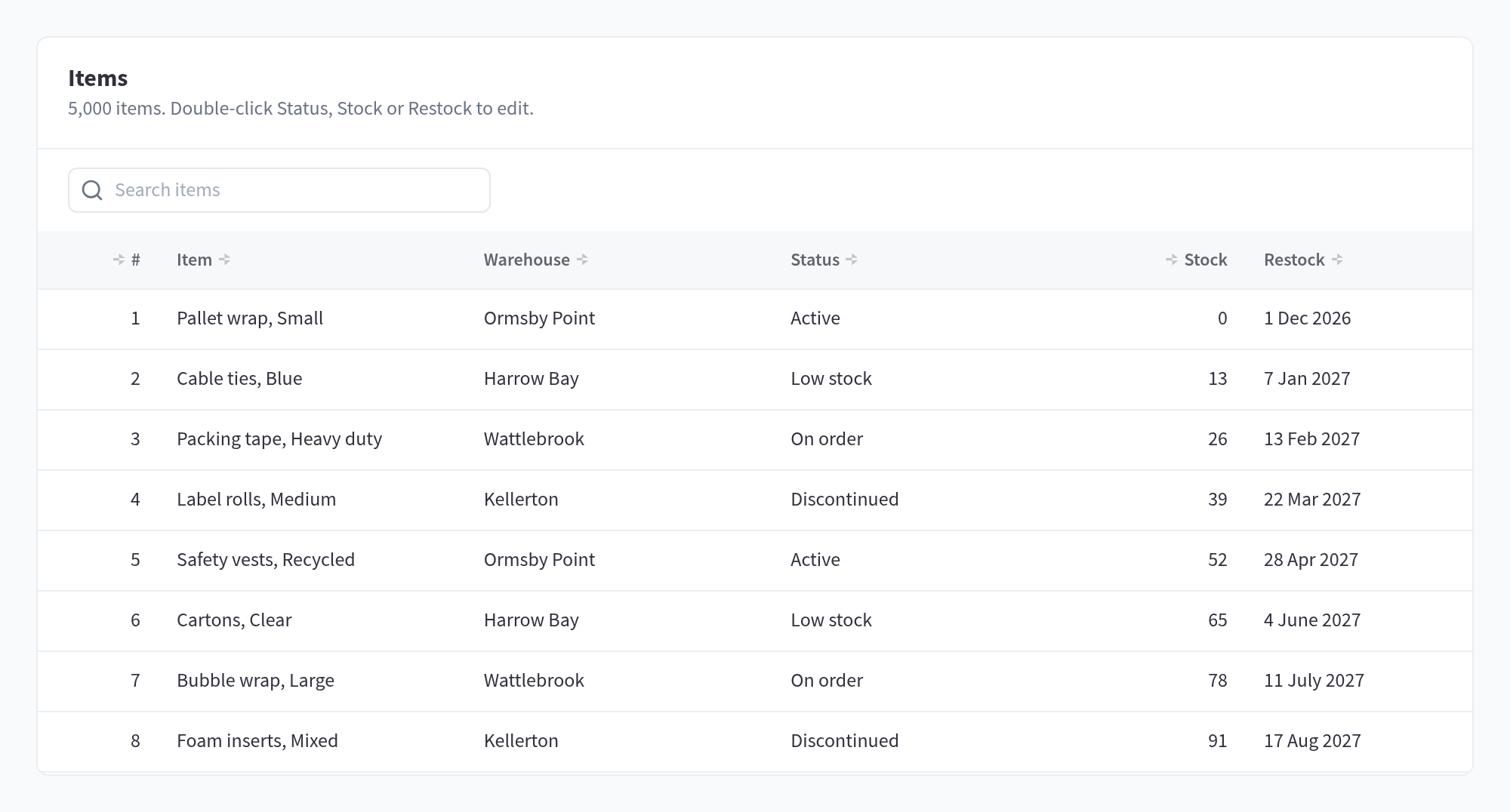
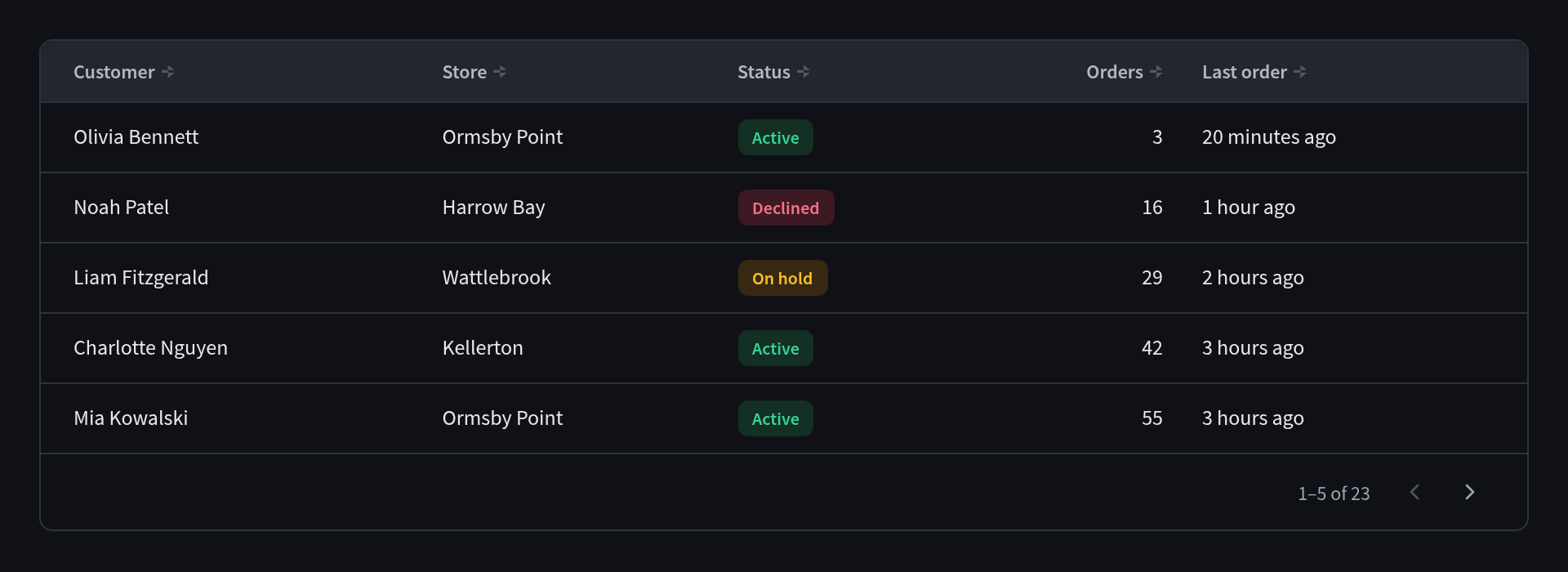 TablesSortable, paged tables of records

 Badges and statusBadges, status dots, avatars and keyboard keys
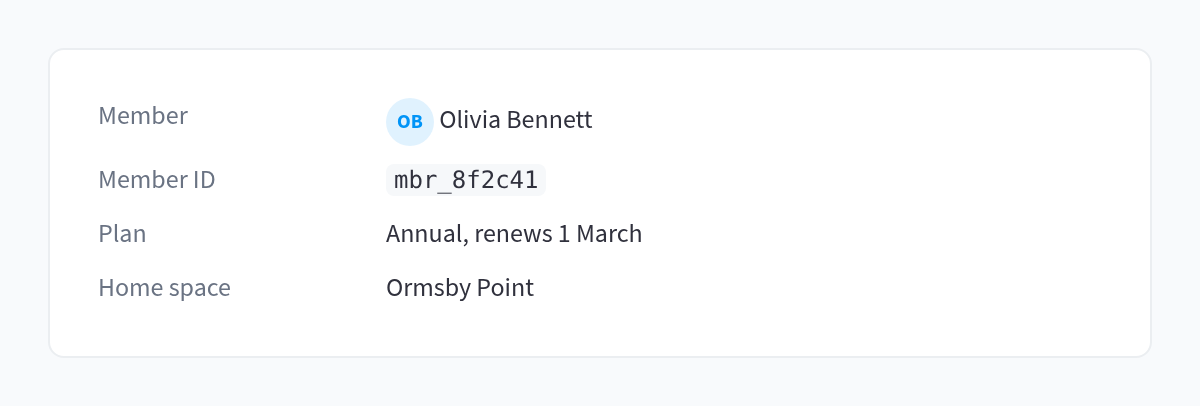
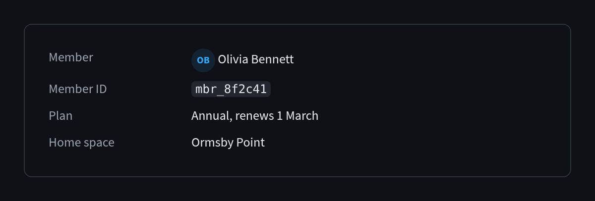 Description listsLabel and value pairs for one record
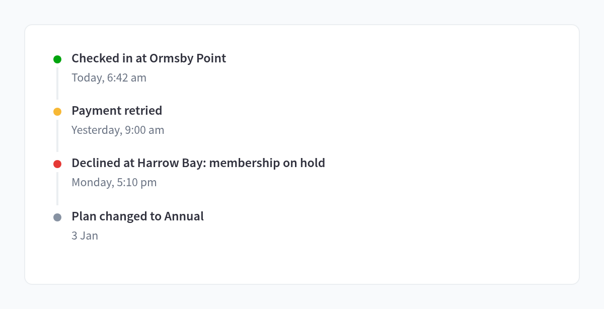
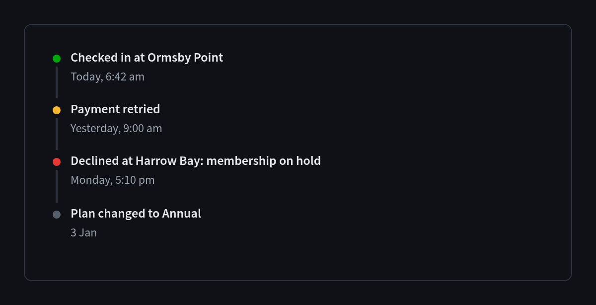 TimelineA record's activity, newest first
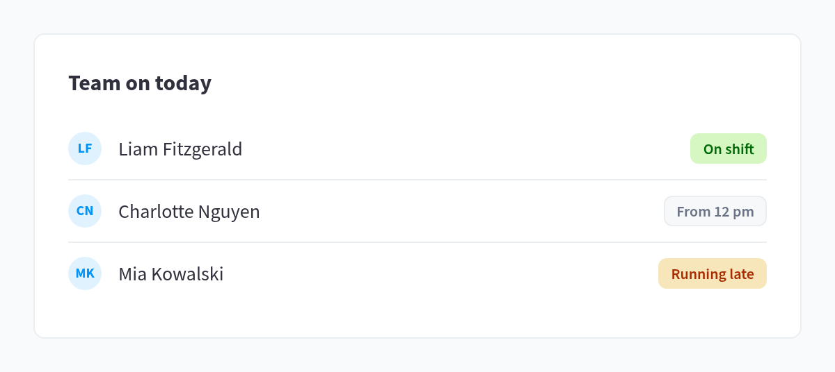
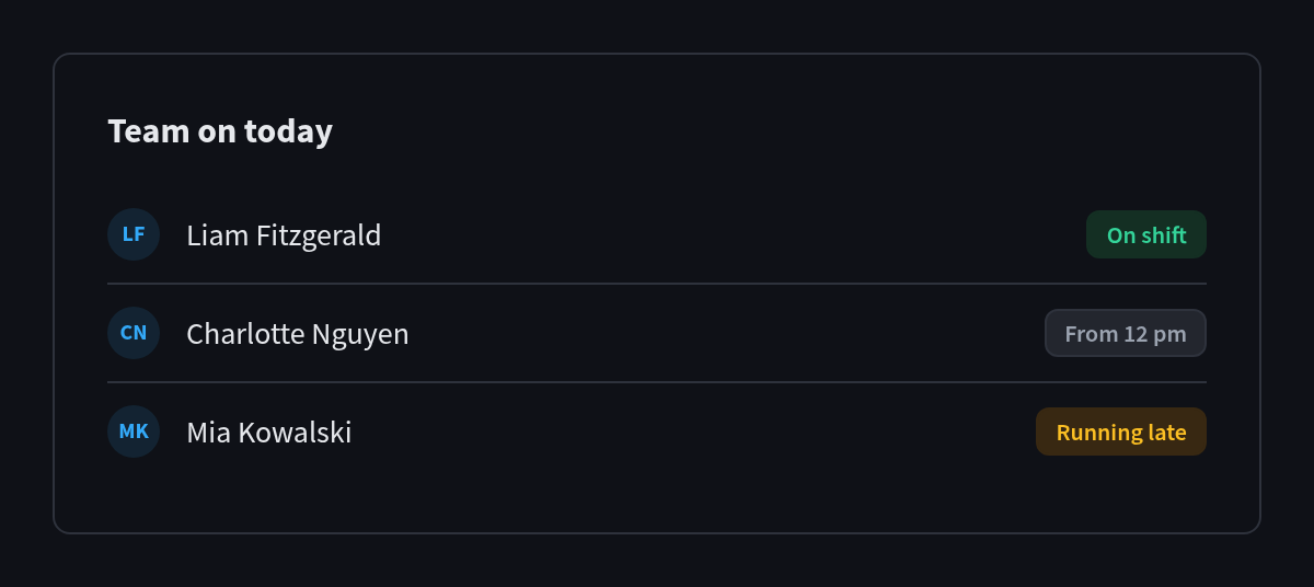 ListsSimple divided lists
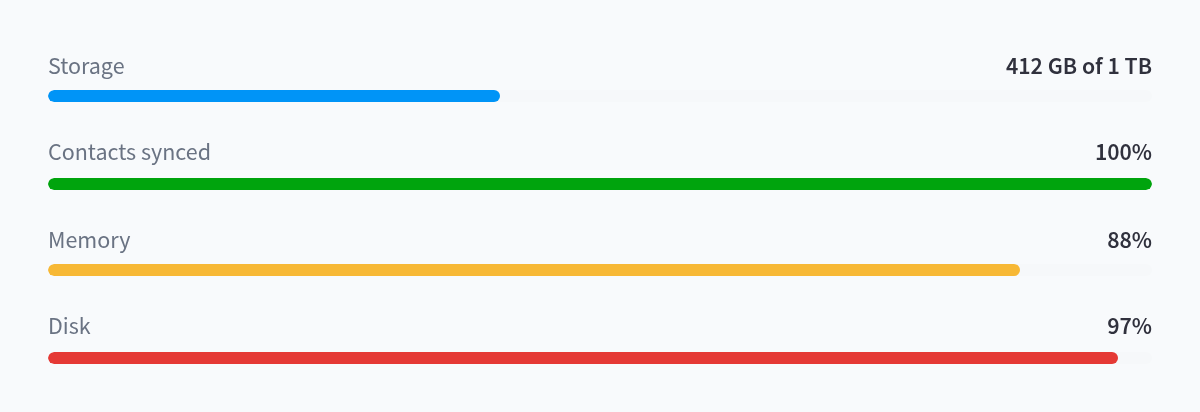
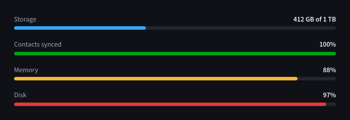 Progress and metricsUsage against a limit, and progress bars

 IconsLine icons sized and coloured for the kit